
master-realty-photography-tips-for-gorgeous-homes
Online listing photos do more than show rooms. They set expectations, shape emotion, and signal quality before a buyer reads a single line of copy.
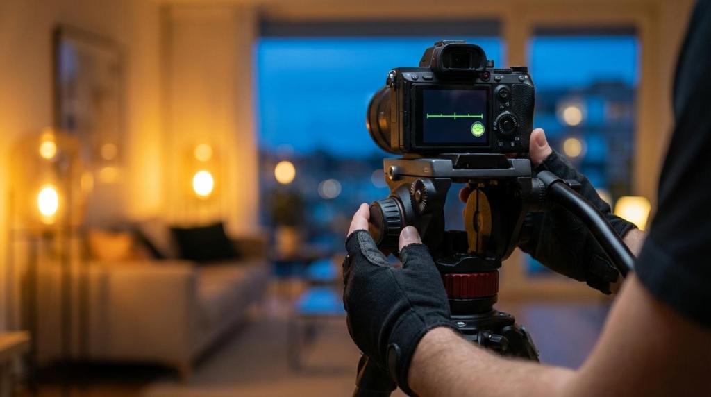
Great realty photography strikes a balance between accuracy and allure: the home looks its best while still feeling completely believable when someone walks through the front door, thanks to well-chosen camera settings.
Every property has a “reason to exist” in the market. It might be the light, the layout, the entertaining zones, or the outlook from the balcony. Your first job is to identify that reason and build a visual sequence that supports it.
Walk through the home with a buyer’s mindset. Notice where your body naturally slows down. That pause is often where your hero frames live: the wide living area that connects to the alfresco, the kitchen that anchors the floorplan, the entry that promises privacy, or the pool that turns a standard listing into a lifestyle pitch.
A tight, consistent set of images nearly always beats a long, repetitive gallery.
Styling for realty photography is less about decoration and more about clarity. The camera is brutally honest about mess, crooked lines, and distracting micro-details that people ignore in person.
The goal is simple: reduce visual noise so the architecture can speak.
After a quick tidy, use a “frame test” by standing in each corner you plan to shoot and scanning the edges. Corners, benchtops, and doorways are where distractions hide, and where reflections love to appear.
A practical pre-shoot reset often looks like this:
If you only have time for one change, prioritise floors and surfaces. A clean floor makes a room feel larger, and a clear surface tells the eye where to rest.
Real estate photography needs to communicate space without trickery. Wide lenses help, yet composition choices decide whether the result feels expansive or distorted.
A full-frame 16–35mm style lens is a common workhorse because it captures enough context while keeping proportions reasonable when used carefully. The key is restraint: go wide, then step back, then level the camera.
Verticals matter. If doorframes lean, the room feels like it’s falling away. Use a tripod, switch on your camera’s electronic level if available, and keep the lens height consistent across rooms. Many photographers sit around chest height for interiors, then adjust slightly higher for kitchens to keep benchtops tidy and avoid seeing too much of the underside of cabinetry.
Good composition habits you can repeat on every job:
A small shift in position can also remove problems. Moving 30 cm to the left might hide a messy laundry door, reduce the risk of mirror reflections, and straighten the view down a hallway.
Light is the difference between a record shot and a persuasive image. It affects colour, mood, and how premium a space appears.
If you can choose the time, early morning and late afternoon often bring softer shadows and warmer tone. Midday sun can work for some exteriors, though it tends to create harsh contrast that makes windows blow out and verandas drop into deep shade.
Interiors are a negotiation between natural light and artificial light. Mixing colour temperatures can turn white walls yellow, green, or muddy. A clean approach is to decide which light source is “in charge” for each room, then manage the rest in-camera and in editing.
One reliable method is to use brackets for high-contrast scenes, then blend exposures so window views stay readable and shadows keep detail. Another is controlled flash, bounced or placed carefully, to lift dark corners while keeping the window light believable. Both approaches can produce professional results when handled with care.
Twilight exteriors deserve special mention. A home photographed as interior lights glow against a deepening sky often reads as welcoming and high-end. It is also one of the clearest ways to separate a premium campaign from a standard listing.
Camera settings vary by property, weather, and style, yet a few baseline ranges cover most realty work. A tripod is the quiet hero here, letting you keep ISO low and images crisp.
[markdown] | Scenario | Aperture (guide) | ISO (guide) | Shutter (guide) | Notes | | --- | --- | --- | --- | --- | | Bright exterior | f/8 to f/13 | 100 | As needed | Prioritise depth of field and sharpness | | Overcast exterior | f/8 to f/11 | 100 to 200 | As needed | Even light, watch the skies for brightness | | Interior with good window light | f/7.1 to f/9 | 100 to 400 | 1/2s to 1/30s | Tripod, bracket for windows | | Dim interior | f/5.6 to f/8 | 200 to 800 | 1s to 4s | Tripod, consider flash or extra brackets | | Twilight exterior | f/6.3 to f/8 | 200 to 800 | 1/4s to 4s | Turn on lights, hold highlights in the sky | [/markdown]Shoot RAW if you can. It gives far more control over white balance, highlight recovery, and the subtle tonal work that makes interiors feel calm and expensive.
A strong listing set usually needs a mix: wide frames for layout, mid shots for key zones, and detail images that communicate quality.
Detail photography is a way to quickly elevate a campaign. Stone, joinery, tapware, textures, and feature lighting are often the cues buyers use to justify a price bracket. The trick is to include details that support the narrative, not random close-ups.
Think in “proof points”. If the home is marketed as renovated, show the craftsmanship. If it’s marketed as low-maintenance, show storage, outdoor surfaces, and clean transitions. If it’s a hospitality property, show the guest experience: bed styling, bathroom finishes, arrival moments, and how the room sits with the view.
One sentence rule: if a detail shot does not change how someone values the property, it probably does not belong.
Editing is where you earn consistency across the set. It is also where reputations can be quietly built or damaged.
Perspective correction is non-negotiable. Straight walls and level horizons are a signal of professionalism that buyers may not consciously notice, yet they feel the difference. Exposure balancing is next: lift shadows, control highlights, and keep the room feeling naturally lit rather than artificially bright.
Colour is the most common failure point. Mixed lighting can create orange ceilings and green corners. Careful white balance and selective colour correction keep whites neutral and timber tones realistic. Saturation should be restrained. When everything is too vivid, the image stops feeling like a home and starts feeling like a filter.
Ethics matter as much as craft. Removing temporary distractions is normal. Altering fixed features or misrepresenting views can backfire fast when inspections begin.
A useful editing test is to ask: “Would a buyer feel surprised in a bad way when they arrive?” If the answer is yes, the edit has gone too far.
Realty photography is now part of a broader visual package. Still images remain the anchor, yet aerials, video, and floor plans can carry the message further when used with intent.
Drone work is at its best when it provides context that ground-level images cannot: block size, privacy, proximity to the coastline or parkland, the scale of an acreage holding, or the shape of a resort-style backyard. It is less useful when it shows the same façade from a slightly higher angle with no extra information.
Video can create flow. A simple walk-through helps viewers understand how spaces connect, reducing uncertainty and encouraging inspections. Keep movement slow, framing steady, and lighting consistent so the home feels calm and premium.
Floor plans are the quiet workhorse of the campaign. They turn “looks great” into “I get it”, and that clarity can save time for agents and buyers alike.
Many clients prefer one provider who can deliver a complete suite. AND Photography, for example, offers professional photography and videography across real estate, commercial, and hospitality properties, along with drone footage and floor plans, backed by 11 years of experience and a long track record of satisfied clients. That kind of consistency matters when marketing timelines are tight and brand standards are high.
The order of images changes how the listing feels. A strong first image earns the click, yet the middle of the set earns the enquiry.
Aim for a logical walkthrough: front hero, entry, main living, kitchen, primary bedroom, secondary rooms, bathrooms, outdoor zones, then any context shots like aerials or amenities. This mirrors how people inspect in real life, so the set feels effortless to absorb.
A simple approach many campaigns follow:
If a space is small or compromised, photograph it honestly, cleanly, and once. Trying to hide it usually creates more suspicion than the room ever would.
If you want to improve quickly, create repetition. Photograph similar rooms in different homes and compare your results. Pay attention to your camera height, your verticals, your camera settings, and how you handle windows. Those three factors shape “professional feel” more than most gear upgrades.
Ask agents what images buyers mention at inspections. Ask vendors which rooms they felt were represented best. Use that feedback to refine your shot list and your editing style.
Progress in realty photography often looks like fewer photos, stronger angles, cleaner light, and calmer colour. When those are in place, the property’s character starts to carry the marketing, and that is when your work feels effortless to clients and irresistible to buyers.